Monday 30 July 2012

Aquarelle Tuesday - with Cathie van der Stel

Last week Cathie van der Stel organized the aquarellistas' painting afternoon (I was in Holland partying) She did a great and inspiring job by the look of it:

Very promising start of a new free (background/Foreground/Detail) work by Brigitte Jansen

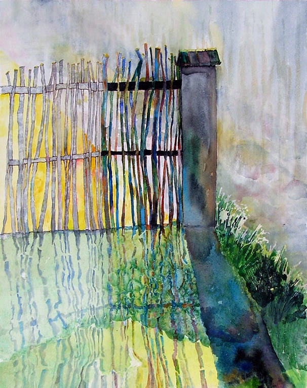
Free work by Cathie van der Stel - turning it 90° has made it even better!
Edith Alborni's free work... Notice that everyone's looks like seascapes?
Sandra Seymour-Dale's free work  - finished!

In the starters group Cathy Dariel worked on the transparency exercise.
The objective is to suggest the transparency of a curtain, by painting the subject in lighter tones where it is behind the curtain... Worked!
... and Cathy also painted a beautiful transparent marble...
Jim Kane worked on the starters exercise with spheres.
He did lots of experimentation with all kinds of ways to make a final result. He must have enjoyed it by the look of this painting!
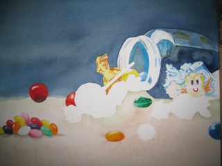
Edith Alborni and Cathie van der Stel also worked on  their 'sweetie jars'.
Cathie finished hers - isn't it absolutely fabulous!!
Look forward to Edith's in next weeks post ☺

Tuesday 31 July is the last Aquarellista session of the season, we are closing for the summer and starting again Tuesday 11 September. The Tuesday afternoons will be taken over by Katinka Westhoff, who will give a couple of classes in 'Painting with Pastels!!

Friday 20 July 2012

Aquarelle Tuesdays with

Cathie van der Stel

Last Tuesday the aquarellistas worked on an 'inspiration' exercise, something that is almost undoable in other techniques, but super easy and great fun in aquarelle!!

Cathy Dariel
It goes like this:
Make a lot of thin paint in a couple of colours. I recommend 'cool' bluish tones because it is used for a background, but you don't have to... Then wet your paper, irregularly, randomly, leaving dry spots too. When done with the clear water, drip in the colours, move your paper so that it drips in every direction, in short, try to be as random as you can!


Edith Alborni 

 Let the paint dry and when it is dry, have a very good look at it. Maybe you see shapes that you recognise. Let them inspire you and make them darker, I recommend a warmer colour, because it is your 'foreground', but it is of course up to you, you're the artist... Sometimes you 'see' it immediately, sometimes there isn't anything catching your eye. In that case, just follow the shapes you see, randomly paint rims and borders and keep on doing it.

Jim Kane

There is no result obligation, you have to do it just for the fun of using your brush and creating shapes. And after a while you'll see that very beautiful and interesting forms appear.

 
Sandra Seymour-Dale

If you have your foreground, in whatever shape, you can add patterns to it, the 'details' like dots or stripes or hearts or just 'cauliflowers' or salt...

Brigitte Jansen

Do this until you are finished or until you are fed up. If you don't like your painting, put it away for a couple of days then look again!

Monique Randazzo

Chances are that you now like it completely or at least part of it... If not: therapeutical tearing up is recommended...

Wednesday 18 July 2012

Nelly's class


Claudie Deforge has finished her lovely study of men passing the time of day and chatting in the sun, using a limited palette to excellent effect.
Posted by Picasa

Monday 16 July 2012

Aquarelle Tuesdays with Marina KUlik

Colourful Parasols by Georgina Sadler

The holidays are there in the South of France, the sun shines, the weather is superb and the groups are smaller... On the other hand, the Aquarellistas have guests coming over and some of them are very talented! Like Georgina, Cathie van der Stel's guest. She created the painting above (unfinished)

The 'regulars' worked on exercises, unfinished and new projects, of which several pictures that I took didn't work out. Sorry! But just to show once more how stunning and colourful watercolours can be, here are two that worked out:
The Candy Jar by Cathie van der Stel

The Volume Exercise by Jim Kane

Nelly's class in July


Helen Humphrey has just completed this beautiful painting of her new home in her characteristic impressionistic manner.  The colours, fluidity and style all contribute to the feeling of a lovely summer day in the Cote d'Azur.

Nelly's oil class, July


Helen Humphrey records the first summer in her new home in her own beautiful, impressionistic manner.  The fluidity, colours and style bring to life the sun, lavender and cicadas of the Cote d'Azur.
Posted by Picasa

Nelly's oil class in July


Easily recognisable, Eugene Rea continues his series of textural studies of doors, walls and windows in the local villages.  You can feel the warmth of the sun radiating from the stones.
Posted by Picasa

Monday 9 July 2012

Aquarelle Tuesdays

Light, Dark, Contrast - and Sweets

Sunlight in the pond by Sandra Seymour-Dale
In this post we start with two wonderful and interesting aquarelles by Sandra Seymour-Dale. Sandra works as follows: she often uses a picture (she takes them herself, of something out of nature) to let herself be inspired. The lines, or the colours, or the shapes - lead her towards a more or less abstract work. It usually takes several sessions and layers before she is happy, and as you can see above and below, it's worth the time spent on it!!
The entrance of the cave by Sandra Seymour-Dale

A project to be finished - Cathie and Edith are both painting a candy still life - colourful jelly beans and other nice colourful sweets in a glass jar. From the same picture and you can see that - but still their 'handwriting' is so different! Love that ☺- and look forward to the finished paintings

Edith Alborni

Cathie van der Stel
Rose-Marie worked on 'spheres' - a starters exercise with interesting results, and Mieke used her last day before holidays to paint wonderful cupcakes!
Jellybeans by Rose-Marie Duclos

Cupcakes by Mieke van Papen

The holidays are starting, almost everybody is eithet going away or has people staying, so the classes are getting less full! This is your chance to get some extra attention of your teachers!  And get results like this....

'Who's behind the Carnival Mask' by Cathie van der Stel

Sunday 8 July 2012

Cover Competion

The cover of Chris France's second book by Sandra Seymour-Dale

You may remember that Marina's drawing group participated in a contest to design the cover of the second book about 'Valbonne and the lives of the idle rich' by Chris France.
14 participants drew Chris in several poses during a sunny Monday morning and then had almost 2 months to work out their sketches in a full colour design. Not everybody had the time and the energy to work it out, but 6 showed their results last Monday and I proudly present them:
Chris France by Wim Teunissen

Chris France by Bevvy

Chris France by Cathie van der Stel

 Chris France by Brenda Moorhouse

 
 Chris France by Fiona Biziou

Chris chose the painting that was created by Sandra Seymour-Dale because it had the qualities that go best with the book: it is funny, sharp and slightly silly. Furthermore it had the dog Banjo in it, something which Chris really appreciated... But he was very impressed with all of them!

He talks about it in his daily blog (if you scroll a bit): www.valbonnenews.me

Wednesday 4 July 2012

Summer Lunch for Friday Class 29/09


Summer is finally here and Friday 29th was the last day of class for the Friday "atelier libre" class. They worked all morning on an interesting pose.
Artists hard at work - some sculpting, some drawing
Afterwards, Christie's 2 classes joined up for the annual summer lunch.

What a feast !

Sculpture Classes Start up again in September.

Happy Summer to everyone from Christie.

Monday 2 July 2012

Starters group Aquarelle

Abstract by Jim Kane

The new aquarellistas group is working very well! Above a part of Jim Kane's work on the 'copy the colours' exercise... A starters exercise, where the objective is to get the same colours of an abstract image (shape not impotant) Well done - and at the same time showing how bright you can get with aquarelle watercolours!
Spheres by Cathy Dariel

Another exercise, shown above, teaches how to paint realistic, volumous, realistic  marbles. Important is the consistency of the direction of the light (highlight and shadow) and the fact that the light comes back on a rounded object from behind: this effect is achieved by leaving a tiny bit of white between the object and the shadow...

The volume exercise by Cathy Dariel
All of the above comes together in the 'suggest volume' exercise. Cathy is still working on it - and the volume starts coming, especially in the upper right and left!


And last but not least a typical Aquarelle Starters exercise, where the left part of the rainbow is created by mixing primary colours (red, blue and yellow) to get the secondary colours (violet, green and orange). Jim also tried out a couple of things... and has an impressive signature!